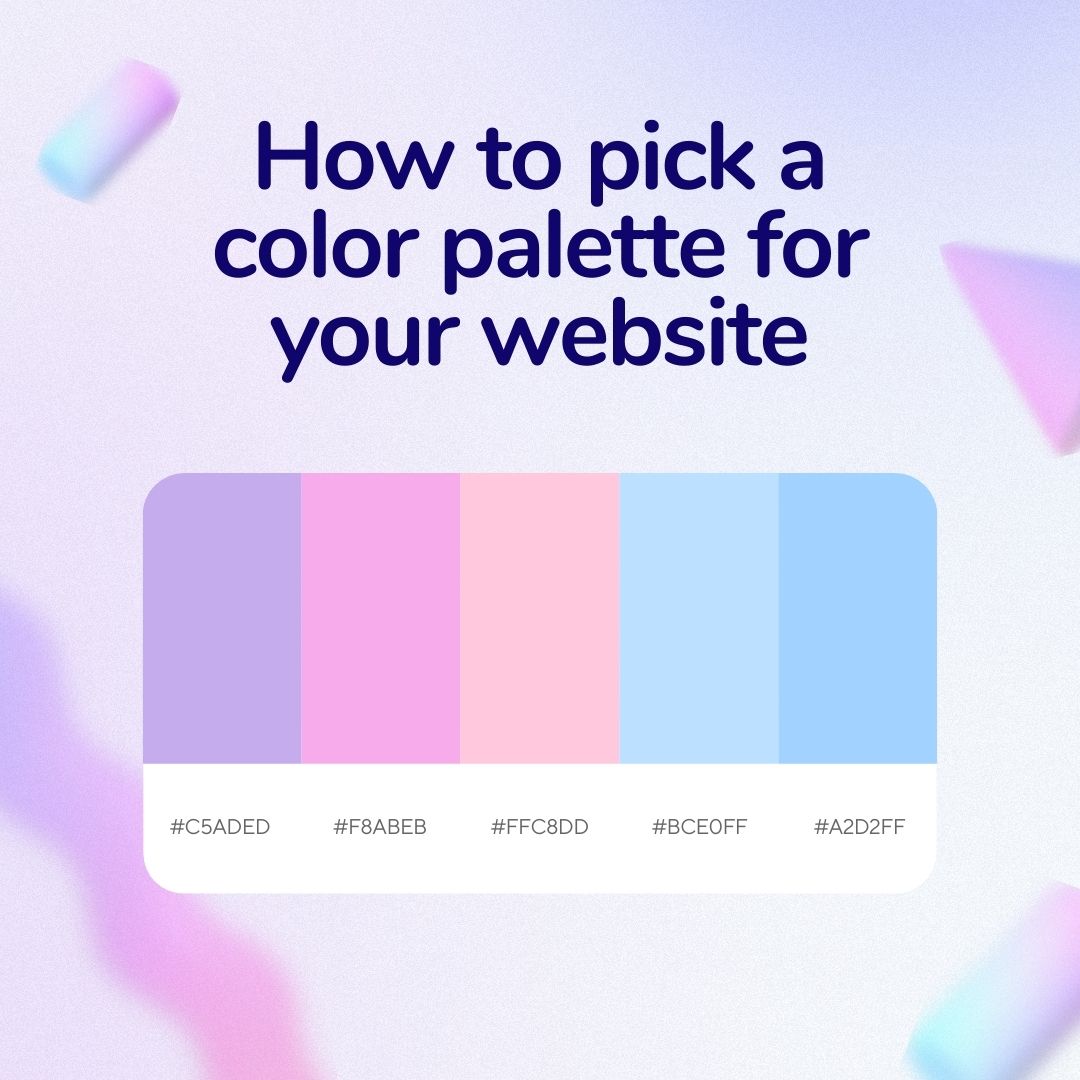
How to pick a color palette for your website


How to pick a color palette for your website
A bright yellow morning with blue skies gives us a boost of energy and tells us a sunny day awaits, while a grey and stormy sky lets us know to bring an umbrella along with us. This is what we have to take into consideration when choosing a color palette for our website.
The colors you choose for your site will determine what visitors perceive of your brand’s personality and can ultimately impact whether they choose you over your competitors. Yes, color is that important. You want to be sure to make an informed decision when it comes to color choice in order to get a positive reaction from visitors.

What is a website color palette?
Before getting on to the more detailed part of choosing a color palette, let’s define what the term actually is. A website color palette goes beyond your logo and font color, these choices will determine the look and feel of your site to visitors. If you do choose color over white and black, then expect these to pop up anywhere from the background to headers, text, and sections. Even for those that go with whites and blacks, the tones of those choices will also play a big role in the overall look of your site.
Think of the palette as your color toolbox from where you will choose to highlight, decorate and create moods for all the sections in your site. Never forget that there is a psychology of colors, which affects perception, choices, and changes depending on cultures. This is something to always keep in mind for your target audience when choosing the colors of your website. All of these decisions impact your website aesthetic, brand personality, traction, and more.
Why does your website’s color palette matter?
So, we talked about how color influences visitors on your page, the way it will impact most aspects of your site and what the color palette is. Let’s take a closer look at all the ways in which color can help you improve your site and increase conversions.
Distinction
Having a digital business card, a one-page site or an amazing complex site is nothing if you don’t make an effort to stand out. Making your color palette something unique to your brand is one of the ways to achieve this. Yes, everyone uses color but it’s all about finding the right fit for you and the type of audience you want to attract.
That’s why studying color psychology before choosing is important, it’s also why you should take a look at the competition before getting started as well.
Attractiveness
The color palette that you choose for your website will play a huge role in visitors staying or leaving. Having enough distinction and readability can make them more eager to scroll and discover what you are offering.
They say don’t judge a book by its cover but unfortunately, that does not apply to websites.
Conversion
Having a visually pleasing product makes all the difference in reaching your goals. A whopping 93% of buyers say visual appearance is a deciding factor for buying, and 84% cite color as a top reason for purchasing a product. Talk about a powerful tool!
It’s because of this immense pull color has on visitors that your website color palette should be carefully considered and planned out. This will help you maximize your positive effect on visitors and give you a real boost in lead generation.
Tips and tricks on choosing your website color palette
So, you have reviewed the importance of the color palette for your website and the effects it will ultimately have on your lead conversion rates. Now, it’s time to get some easy-to-remember tips and tricks to make the best color palette decision.
Define a personality
One of the best ways to begin the selection of a color palette is by defining the personality of your brand. This first step can be as simple as selecting a few characteristics you would like to be associated with and using color psychology to pick the colors that best represent them.
It’s important to remember that your audience plays a heavy role in determining color choices, as color signifies different things depending on the culture. For example, purple is tied to royalty in many western cultures while in Brazil it’s used to represent funerals and mourning. Research your customer’s personas culture in order to hit the mark when it comes to color.
Make it readable
Another important aspect to consider when choosing your color palette is to make sure it is easily legible for visitors. Meaning that if you have a call to action in a box and the color of the box and the text clash, visitors may miss it altogether. This can also happen with other aspects of the website.
Remember these basic color readability rules:
- Light background, dark text. This is the best combination for readability. Classic white with black text is recognizable and easy to spot.
- Gradient background, dark text. Another good option, a light-colored gradient can allow you to add some more color while still permitting the dark text to be read.
- Dark background, light text. Be careful with this, if you have too much text it won’t be pleasing, but for a smaller portion, these inverted combinations can work. Avoid dark on dark, like a dark red or purple on black.
- Don’t use two colors that are close in shade, it leads to blending and missing the text.
- Avoid using too many bright colors, the sense of highlighting can be lost and sections will start to mix together.
Let the templates help
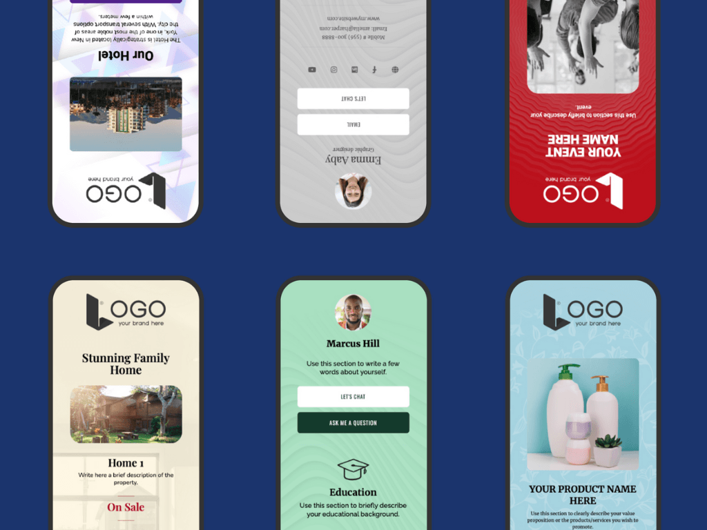
Using templates is a superb way of getting your color palette right. With a platform like Linkcard where professional designers are in charge of creating templates, color psychology and marketing have already been implemented for you. So, all you need to do is choose and personalize to get started.

Examples and color tools
To get you on the right track to choosing a color palette that works, take a look at sites and brands that you like. See what colors work and take inspiration from them. There are also a ton of color palette tools available, like generators and color wheels.
What else might help? Research your competitors, this will help you be able to differentiate your brand from theirs, plus you can get a sense of what the industry identifies with so you can meet the standards.


