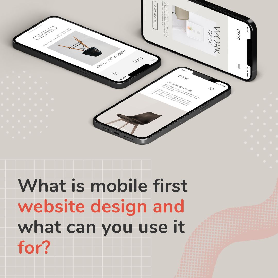
What is mobile first website design and what can you use it for?


What is mobile first website design?
That it is created separately and exclusively to meet mobile user experience standards. All websites must now consider and put a lot of effort into creating great mobile sites to accompany their online presence.
This format of sites is of special interest for anyone wishing to rank on Google’s search engine. Since 2018, the internet search giant has been placing more and more weight on mobile sites. So much that you now need one just to appear on any search. You’ll need it to run ads as well.
Why is it such a big deal? Well, a 2020 study found that 90% of global internet users browse with mobile devices. So, if your website doesn’t work for that format chances are no one is clicking on your site.
What is mobile first design?
Mobile first websites designs is a concept of design that prioritizes creating amazing UX for mobile sites before desktop sites. Focusing on navigation in the smallest and most portable screen from the start. This means the designer behind works on the details of the website in the mobile format and can then move on to bigger screens. Once they have understood the requirement of the site on mobile it’s actually easier to apply to desktop formats.
What are the benefits of mobile first website design?
There are many reasons why this type of website design strategy has become increasingly popular among businesses and brands.
- Consumers are more likely to shop on smartphones than desktops
- Advertising can be more effective and cheaper through mobile ads
- Meeting mobile site UX demands
- Creating a great user experience for the most traffic generating devices
- Passing and exceeding Google’s mobile demands for SEO ranking
- It can be less costly than desktop-focused website design
- Easier to manage, edit and upkeep

Mobile first design vs traditional sites
Many times when it comes to traditional website design the designer and developers will begin working on desktop sites and then scale down to mobile sites. This method can result in the mobile site coming together as a second-hand version of the desktop one. Having a lower-quality mobile site can affect your bottom line and the online shopping experience of consumers.
While mobile first design seems like a very new and foreign idea, it’s really only following trends and hard data. Clicks, sales, and traffic is coming from mobile. So, why not center your design building on that. Although desktop sites will not cease to exist, it’s possible to have a business online with just a mobile site. The mobile site design strategy is cheaper, more functional, and could boost your traffic, and sales!
Best options for mobile first design
So, we’ve told you that mobile first designs can cut costs and improve user experience for visitors, but how exactly can you create a mobile first website. There are two main options for you:
- Get a web developer and designer team, start from the beginning, wait until they can develop and deploy. Go live with your mobile website.
- Use no-code mobile sites builders. With Linkcard you can start with designer-created templates, personalize as you want, add social media, choose your website features, and more. The best part is you can have a mobile site in minutes!
How to use mobile first design
Mobile website design may sound simple in theory, but it requires careful attention to detail and a plan, or template roadmap, to be successful. These websites put users in the driving seat. Everything in mobile sites has to work for users, ensure navigation is easier, and make sense for visitors.
Focus on content
Because of limitations of screen size and bandwidth mobile designs need to keep their focus on the quality of content. Whatever ends up on your mobile website must serve a purpose, no-frills no unnecessary add ons.
This process of editing content can lead to a more engaged audience since they are truly getting the best of the best on your mobile website.

Mind your design details
Another priority of mobile website design has to be well…design. Here you will have to trim on over decorating, keep things simple, dynamic, and size fitting. To lead visitors where you want them to go create a proper visual hierarchy of elements. Stick to your brand manual and don’t overlook anything.
Prioritize speed and response
Your website speed and responsiveness will make or break your user experience. Visitors want fast-loading sites or they simply go somewhere else. That’s why trimming the excess in design and features is a must. Go with what you must have and be fast enough to please your audience.


